Polling Infographics
In an introduction to statistics, students came up with a survey question to ask Meridian Academy students. They had to come up with a question that only had two possible answers. With their results in hand, students then had to make meaning of their data. As they learned, survey results don’t tell you information with 100% certainty; rather, they can calculate a range with a given level of confidence. Students performed these calculations and put their data together into infographics. Click through these different graphics to learn about our mathematical steps and see how Meridian students responded to a variety of interesting survey questions!
Come talk to our students! You can hear about this and other project work in our Zoom room on Wednesday, June 16th from 7:00-8:30pm EST. Click here to join!
View fullsize
![Zayna]()
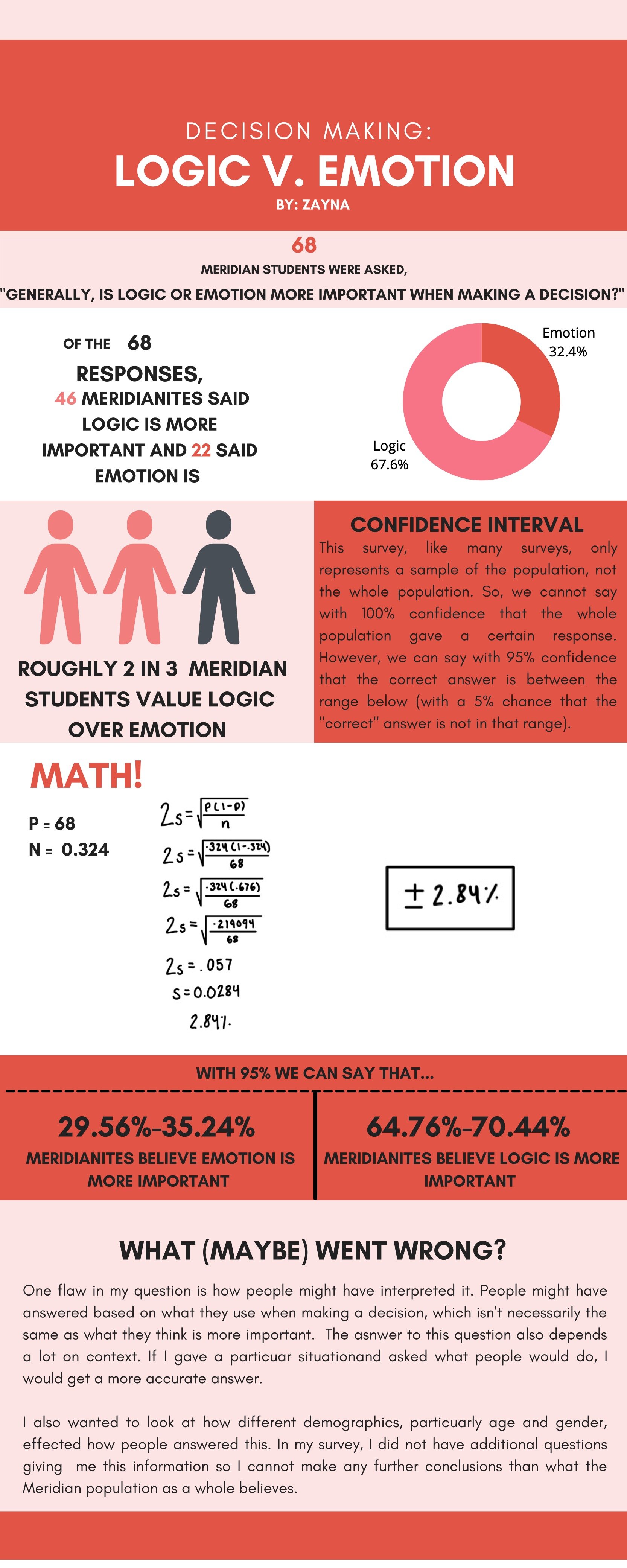
Zayna
View fullsize
![Shanti]()
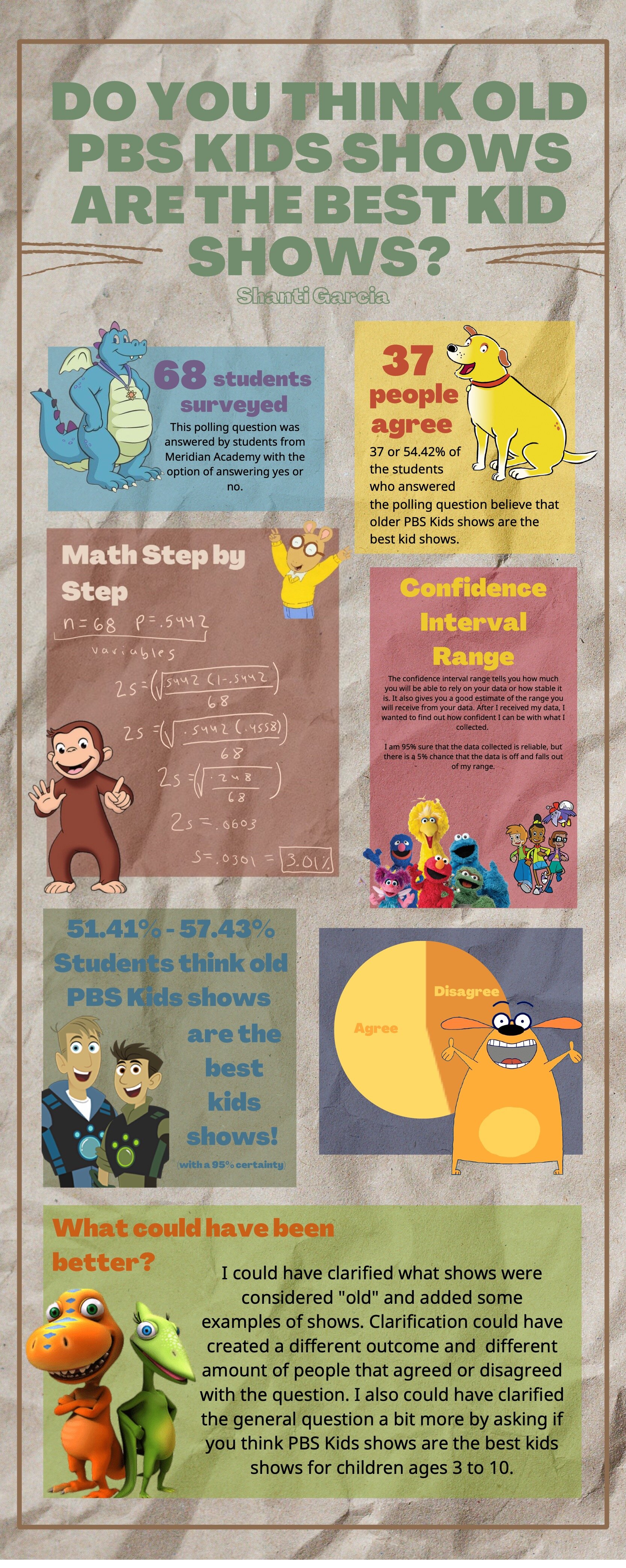
Shanti
View fullsize
![Seth]()
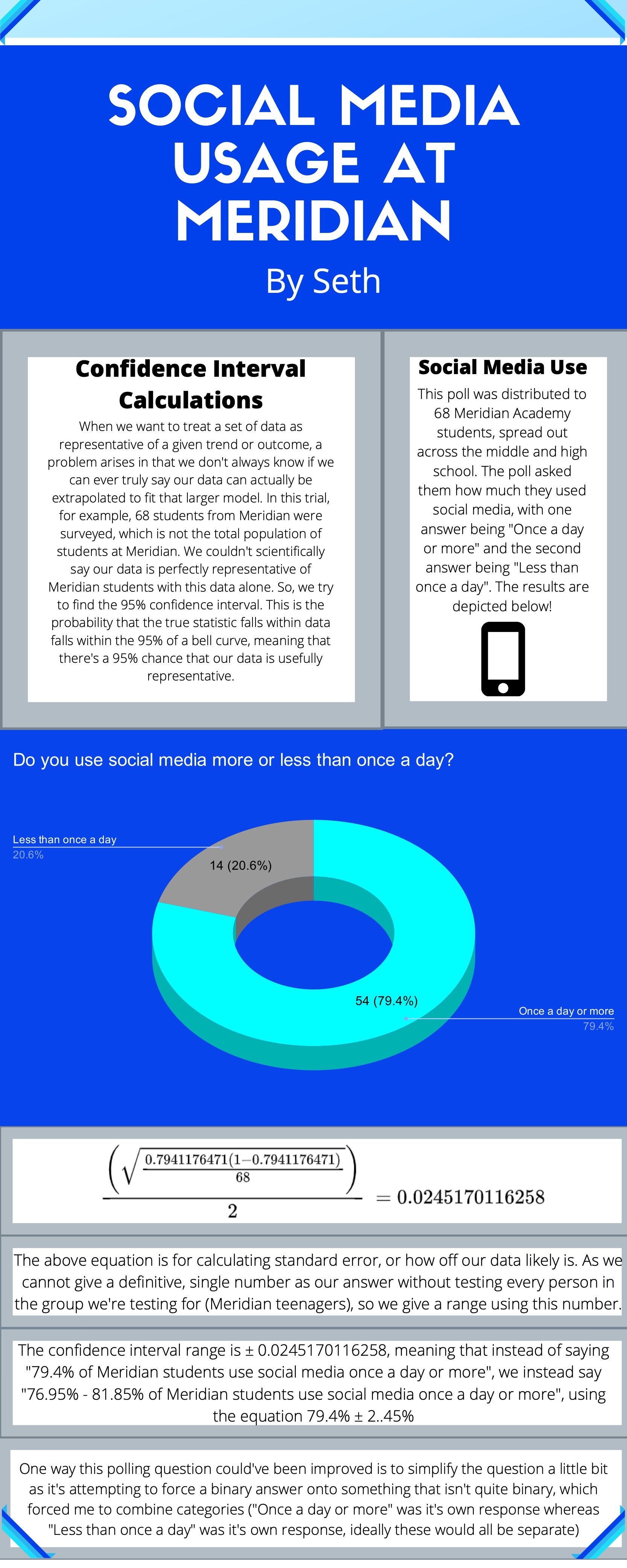
Seth
View fullsize
![Saoirse]()
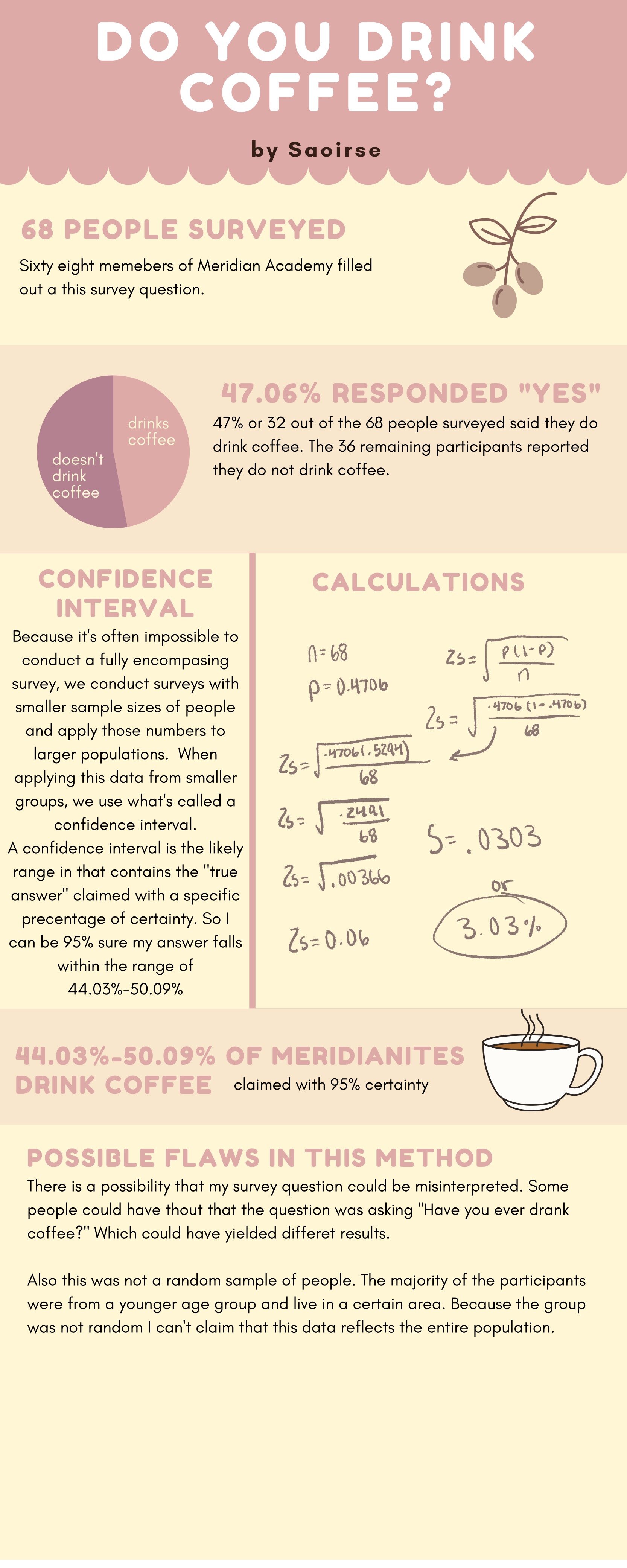
Saoirse
View fullsize
![Phoebe]()
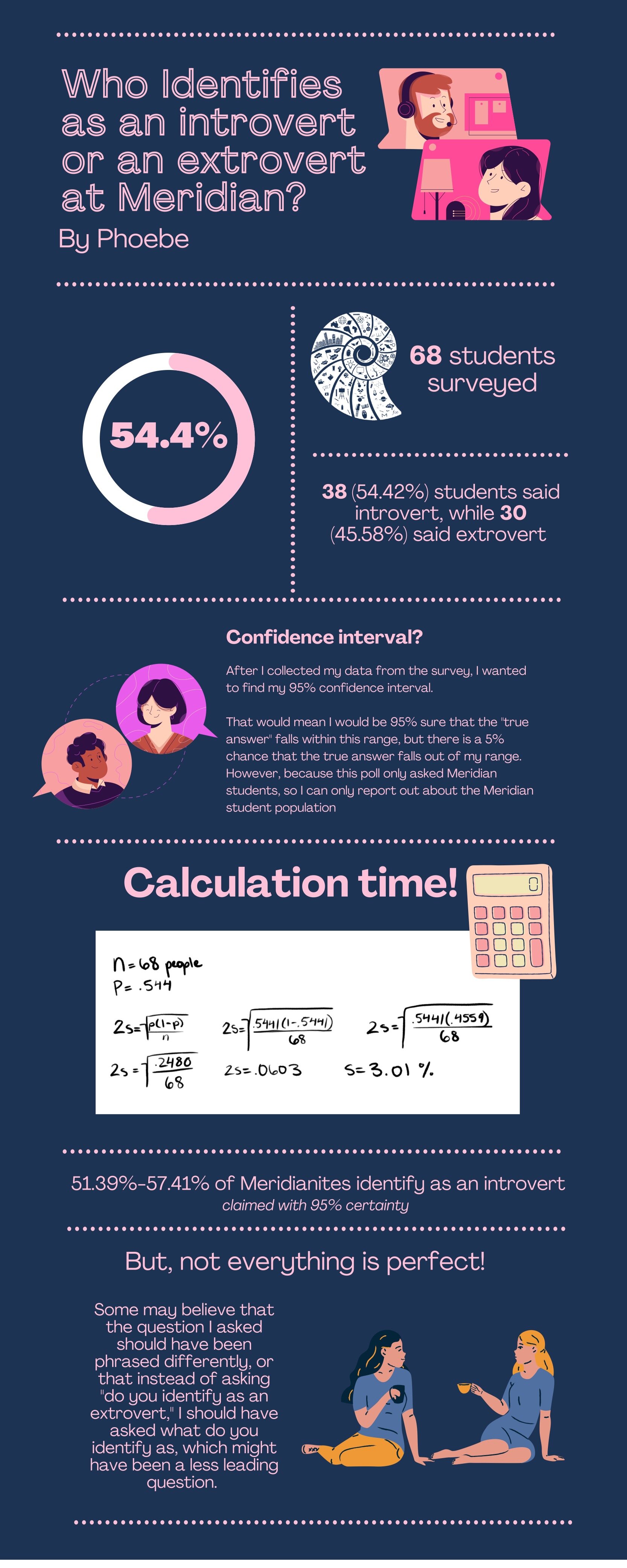
Phoebe
View fullsize
![Phivos]()
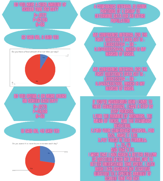
Phivos
View fullsize
![Pashya]()

Pashya
View fullsize
![Nate]()

Nate
View fullsize
![Natalia]()

Natalia
View fullsize
![Mary Alice]()
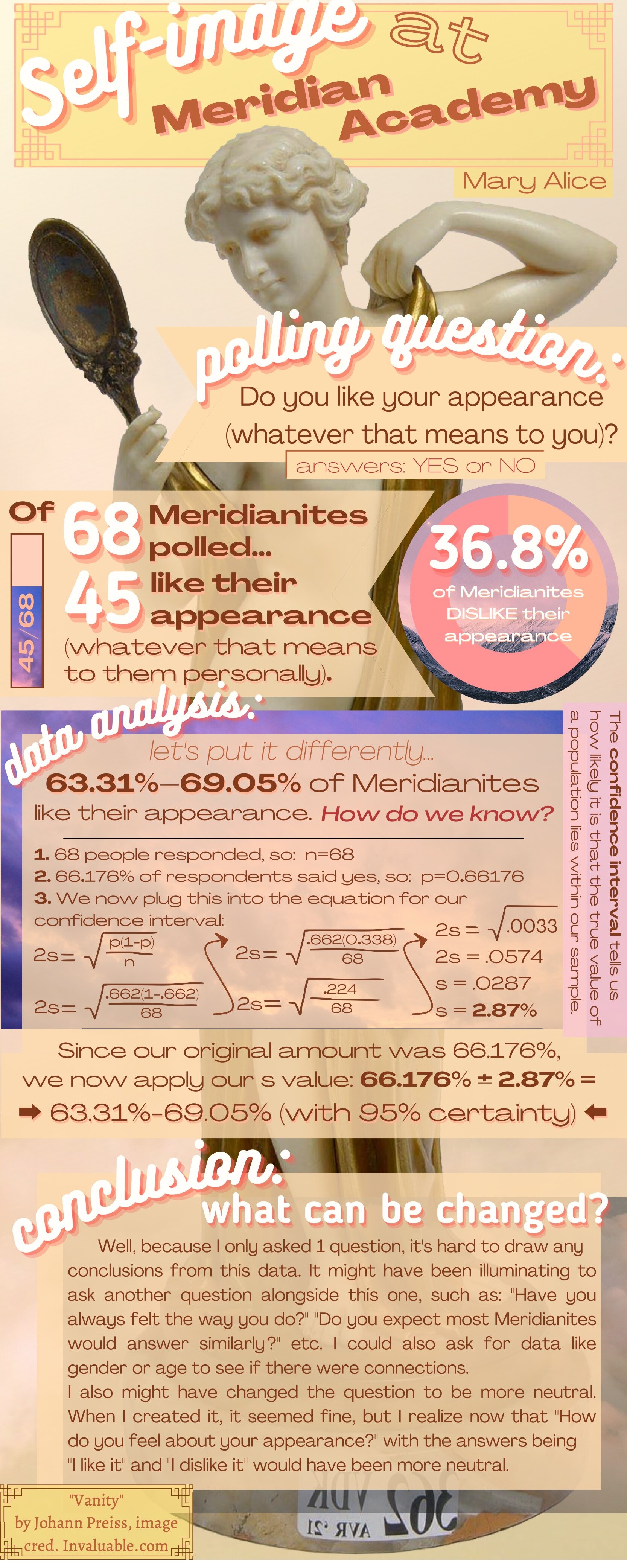
Mary Alice
View fullsize
![Marvin]()
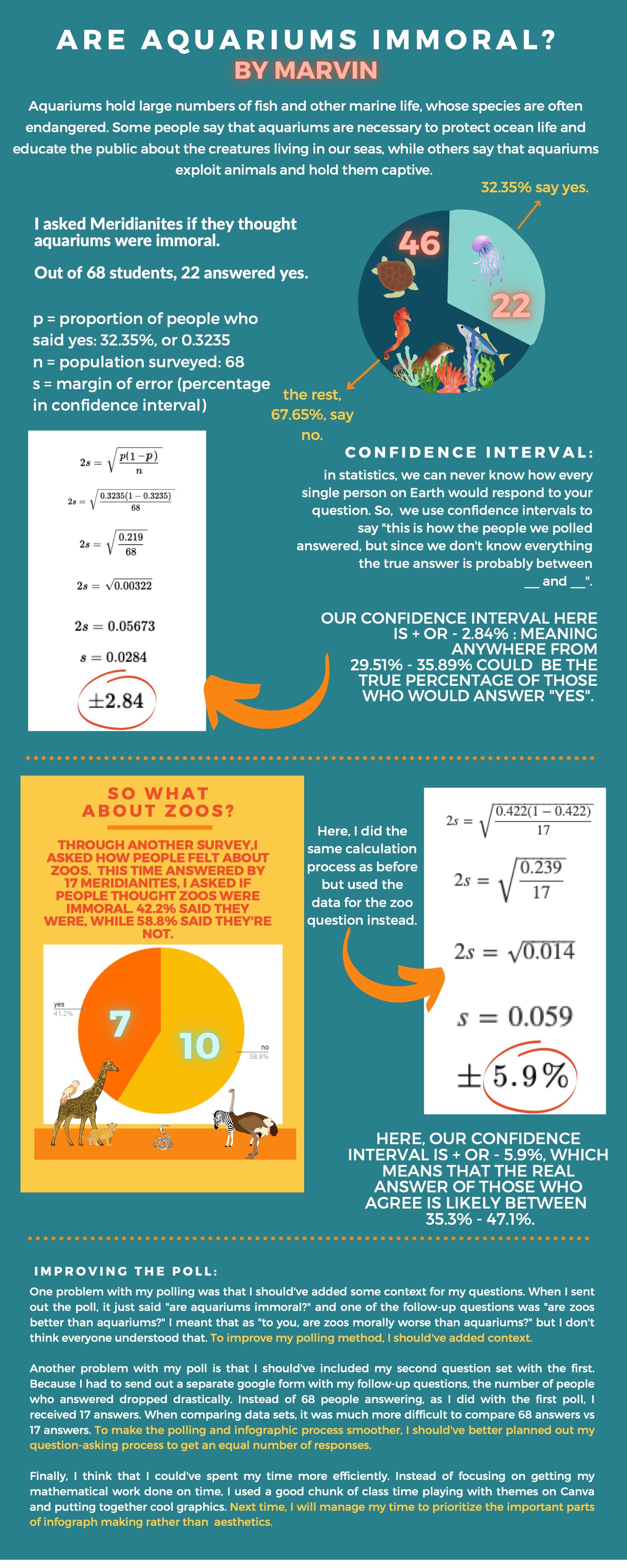
Marvin
View fullsize
![Liam]()

Liam
View fullsize
![Hanna]()

Hanna
View fullsize
![Hallie]()
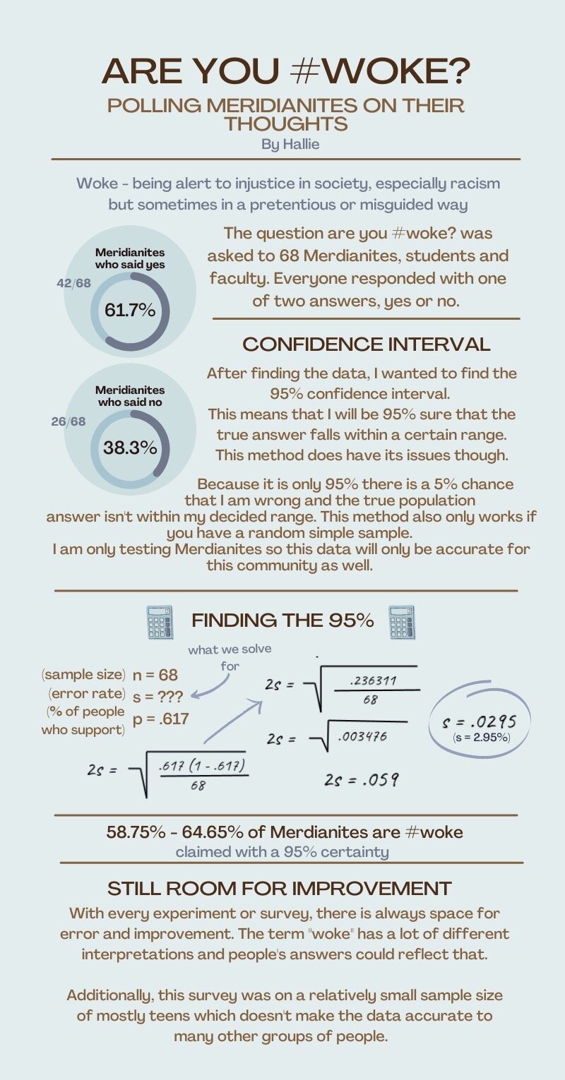
Hallie
View fullsize
![Gus]()
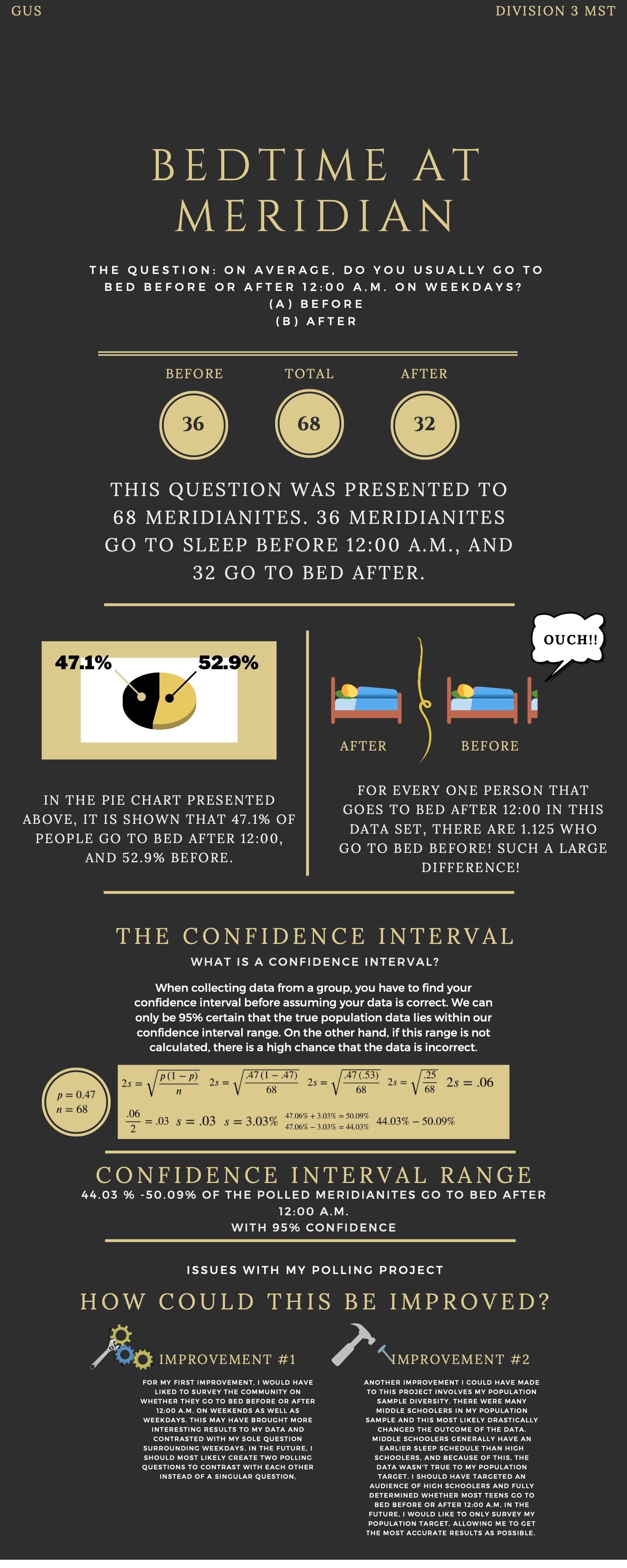
Gus
View fullsize
![Ezra]()

Ezra
View fullsize
![Clem]()

Clem
View fullsize
![Anna]()
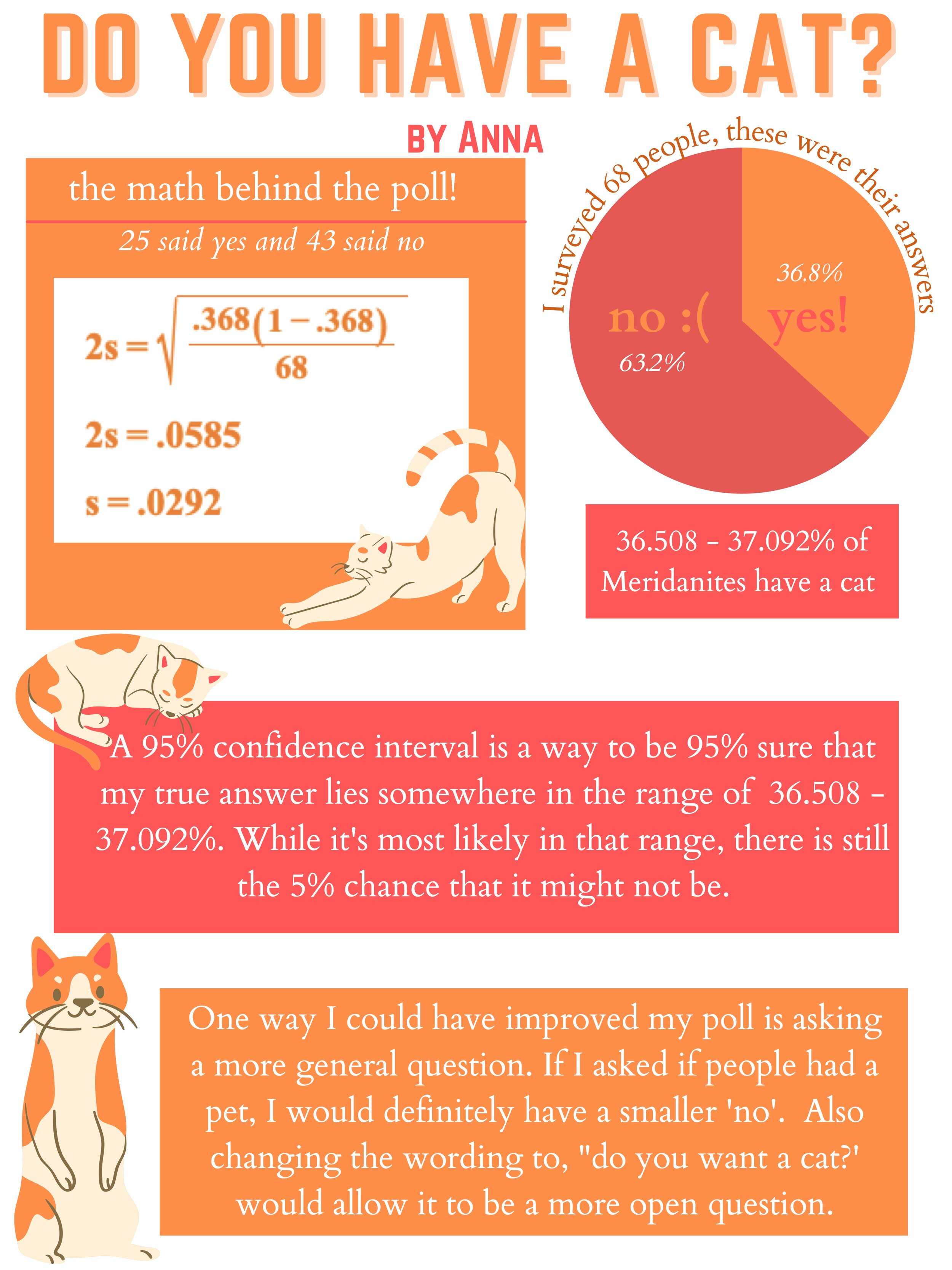
Anna
View fullsize
![Amos]()

Amos
View fullsize
![Tai]()
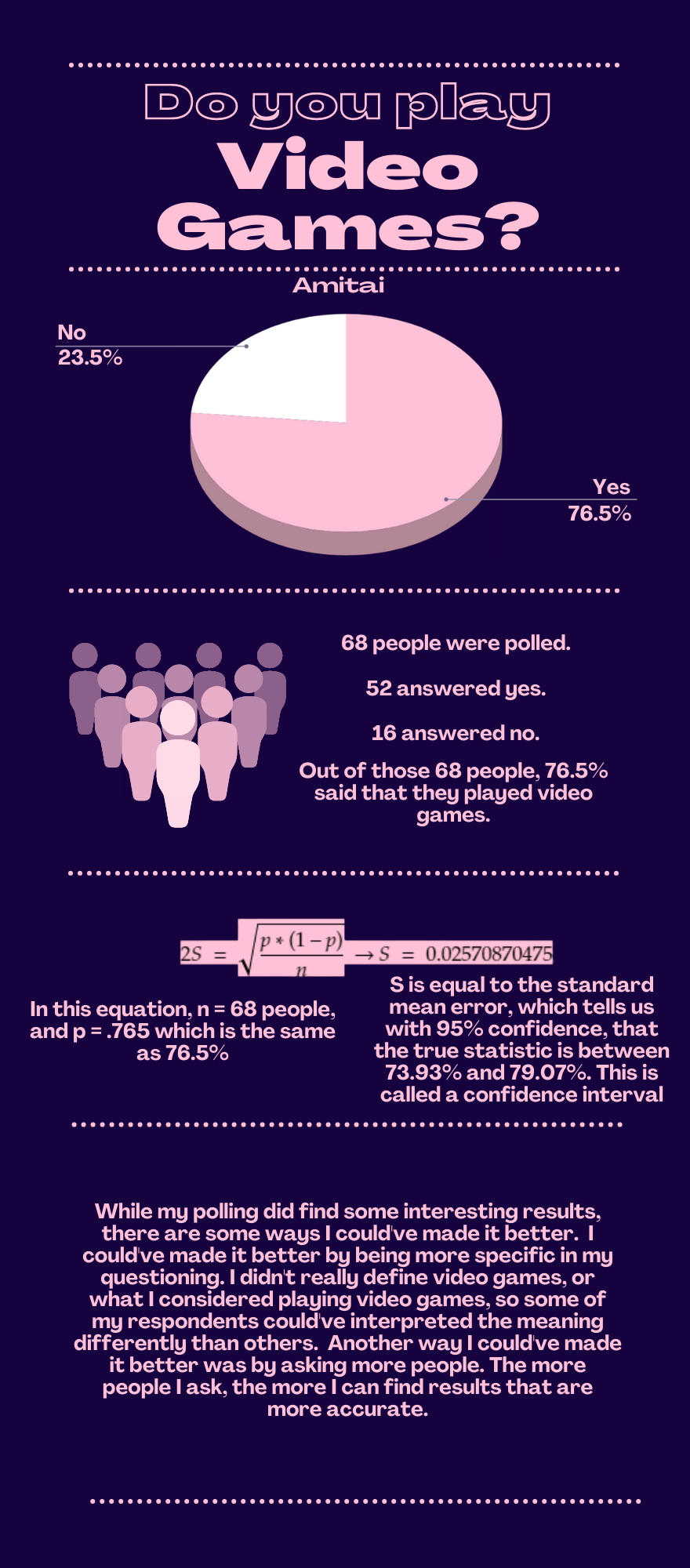
Tai
